Improving the Look of Your Titles
Avid’s venerable Title Tool has come in for a lot of criticism over the years, but despite its limitations, it’s often the best way to get a simple titling job done, and it has many hidden features that many people don’t seem to know about. Here are a couple of my favorites.
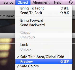
First, when you’re creating a title, the tool normally defaults to draft mode, which makes your titles look crude and aliased until the title is actually created. That made sense in years past when processors were slower, but today you can work just as quickly in what Avid calls Preview Mode, and your work will look exactly as it will when your title is rendered. You’ll find the Preview command in the Object menu.
Here’s a title in draft mode:
And here it is in Preview mode, looking just like it will when edited into the timeline.
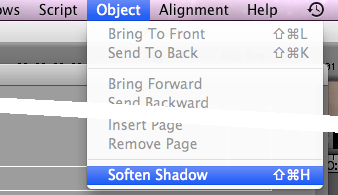
Second, Media Composer normally creates harsh and crude drop shadows — but you can soften them with a simple menu pick, and if you do, they’ll look a lot more subtle. This option is also in the Object menu.
Here’s a standard drop shadow:
And here’s the same shadow, softened:
Finally, when you open the title tool, a font is selected by default. On the Mac, it’s Geneva, which is rarely what you want. You can’t permanently change the default, but as long as there’s no title present in the title tool, the font and size selections you make are “sticky” and will persist as the default until you quit. If you want to make a series of titles in 24 pt Helvetica, for example, start by selecting those options — before making your first title.
Explore posts in the same categories: Avid, Avid Technical Tips


Leave a comment