Archive for the ‘User Interface’ category

Collapse the Composer Window

November 13, 2009

I explained in the last post how you can hide the Source Monitor, but you can also collapse the  Composer window, hiding video entirely and showing only buttons, menus and tracking information. This can expand your screen real estate mightily, making room for a much-enlarged timeline with plenty of room to manipulate audio keyframes and see waveforms. If you’ve got a client monitor, you’ll view video there.

mini-composer-2

This view was once called the “mini-composer.” To invoke it on a Mac, simply hit the the green “+” button at the top left of the Composer window. Or right-click on a video image and select “Hide Video.” To go back to your regular Composer view, hit the plus button again or deslect Hide Video.

You can do anything in the mini-composer that you could do in the regular composer. Trim mode is available, for example, and works as you’d expect. You can even drag from a bin to the source or record monitor. Just drop your clip onto the mini-composer window.

Of course, you wouldn’t work this way all the time, but for audio work, it can be very useful. I make it part of my Audio Toolset. (For more about Toolsets see this video post.)

Clean the Mouse

June 16, 2009

I know it sounds faintly ridiculous, but cleaning your mouse can make a real ergonomic difference for your wrist and forearm. I’m often amazed at what people will put up with in a mouse. It seems like this is the most basic connection you make to the computer. Many of us are dragging and clicking on it non-stop, and it ought to feel as good as it can.

I’ve got a Microsoft Intellimouse Optical, which I love for it’s low profile (easier on your wrist), very smooth travel, flexible software, and the presence of five, easily distinguished buttons. It only touches the surface on four small feet, but they can get gummed up. The deposit can be nearly invisible, but it can produce a noticeable increase in the effort needed to move the thing precisely.

I’ve been working pretty hard lately and thought I was feeling resistance in the mouse. The feet seemed okay on quick inspection, but a couple of minutes of scrubbing made me realize just how bad they were — it felt totally different. I use rubbing alcohol for this purpose, available for a buck or two at any drug store. It’s best to get the concentrated, 91% version, which contains less water and makes it safer on equipment. And be sure to unplug the mouse before you start!  It’s tempting to just turn the thing over and look at it, but you don’t want to be looking into the laser.

Your mousepad is also critical. They may look similar but small differences in the surface texture can dramatically change the way a mouse will track and feel. There’s some kind of alchemy that occurs between the composition of the mouse feet and the surface of the pad. A pad that works best for one mouse may not work so well for another.

You may not be as persnickety about this as I am, but if you’re having wrist or forearm pain, you might be surprised by how much a good mouse — or a clean one — will help. Go to your favorite computer or office store and check them out.

Finally, a suggestion: I program one mouse button as a double-click (a single click on this button has the effect of a double-click). It seems like a small thing, but I do an awful lot of double-clicking to load source clips and this has made a very noticeable difference in the way my arm and wrist feel at the end of the day. It’s also more positive — when you hit the double-click button your clip loads every time. Not all mouse software can be programmed this way, but the Microsoft Mouse driver makes it easy.

An Interface That’s Easy to Learn

May 19, 2009

When I helped start the editing program at the American Film Institute, the idea of teaching post production in an academic setting seemed a little nutty. But the idea that students would someday enter the program already familiar with digital tools? Had it occurred to us, we would have thought that was ridiculous.

Today, most film students enter graduate school with knowledge of several digital media applications, not just one, and Final Cut is usually among them. That’s partly because it’s cheap, easy to pirate, and you get the suite. But it’s also because it follows a drag-and-drop, desktop-publishing approach to editing. For young people, that makes the learning curve less steep. But it doesn’t necessarily provide the best toolset for professional editing. What I’m hearing from faculty at AFI and USC is that after a few months, most students end up preferring Media Composer. They like the precise trimming, the media management and the effects interface among other things. (Chris Hocking recently blogged about FCP vs. MC and came to some of the same conclusions.)

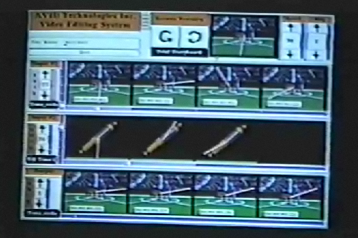
When Avid’s segment mode debuted in the early ’90s very few editors had ever touched Pagemaker or Quark, but there was still an internal debate in Tewksbury about whether drag and drop should be the foundation of the UI. The question comes down feedback. Every computer application has to supply feedback to the user, has to show you what you’ve done. The more responsive, fine-grained and intuitively presented that feedback is, the more control you have.

Imagine that as you typed in a word processor, the text arrived on the screen a second or two after you keyed it in. Even that small delay would drive you crazy, because it would interrupt the feedback loop. Regardless of your medium, if the controls are intuitive and feedback is fast and precise the interface seems to disappear, letting you think about creating and shaping the material rather than the machine itself.

Drag and drop offers good visual feedback, but it’s only telling you about the size and shape of little rectangles on the screen. I would argue that in editing, it’s more important to provide feedback about the film itself. You want to get the editor as close to the film as possible and permit him or her to make every editorial decision based on moving video. That’s why in the MC you see frame images in segment mode, why you trim with JKL, why you can slip and slide with JKL, as well.

An easy learning curve is important, sure, but it’s not equivalent to power, nor does it help you use the system all day in the trenches without fatigue. Fast and precise often means “some training required.” There’s a lot of overlap between FCP and MC — both give you JKL trimming, both let you drag and drop clips in the timeline. But the finesse with which they do it — the tightness of the feedback loop and the elegance of the controls — makes a big difference. There’s still plenty of room for improvement and each can learn from the other. Media Composer Version 3 included much faster timeline performance as recently as last year, something editors tend to notice almost instantly.

Avid has done a lot of internal work lately, and people are starting to notice. Apple will presumably hit back soon. I’m as eager as anybody to see what they have in store for FCS3, but while we wait for the Cupertino marketing juggernaut to ramp up it’s wise to remember that a good UI is many things, some of which are pretty subtle and hard to explain in marketing materials. It takes time in front of a system to find its power, and it takes many iterations to refine an interface.

Toolsets & Workspaces Video

May 12, 2009

Avid’s toolsets and workspaces allow you to set up custom arrangements of your windows. You can turn windows on and off, change window sizes and positions and create various other customizations, and then invoke all of that with a single menu pick or keyboard shortcut. You can also select timeline (or other) settings simultaneously.

I’ve posted a video that shows you how to do it. (Note that these features were updated in MC6. This tutorial applies to MC5 and 5.5. )

Click below, or watch a larger version on Vimeo.

Whither Apple?

May 4, 2009

Now that NAB has come and gone and Apple made no big announcements, we turn to the ever-fascinating question of what’s coming from Cupertino. Final Cut Studio has gone two years without an upgrade. They are surely working on something, but they’ve also been distracted with the iPhone.

A story I like is that Final Cut Studio 3 will be revealed at the World Wide Developers Conference on June 8. Several sources suggest that the new version will focus on integration. Apple’s business model so far has been to buy promising Mac software, loosely integrate it, keep the price low, and democratize the market. You have to buy a Mac to use the software, so if necessary, it can be a loss leader.

Regardless of the power of the individual aps, smooth integration is what makes such software effective for editors. I’ve never been a fan of a loosely integrated suite. (See this post: Is the Suite Sweet? for more.) In my ideal editing environment you put all the tools to work on what some people have started calling a “common timeline.” Whether your tools are actually separate aps or simply modules within the same ap, the key is that they don’t create separate projects that have to reconciled. I don’t want to be conforming my own picture changes.

Adobe has promoted one way of doing this in its desktop publishing applications, allowing you to embed, say, an Illustrator file inside an InDesign document—you right-click on the embedded image to open it in Illustrator. That works, but you’ve still got separate files for each ap that you have to manage and back up. At some point, you start to wonder why everything isn’t under the same roof.

Apple is well-positioned now to focus on integration because they’ve already got a good collection of components. The question is whether they can roll it all together in a way that works for editors.

We’ll know soon enough whether Apple’s going to upgrade FCS at WWDC. In the meantime, what are you looking for from them?

Early Avid Videos

November 29, 2008

avid-prototype-2Bill Warner, Avid’s founder, has posted some fascinating early videos, from as far back as 1987, on the Viddler site. Several cover the earliest Avid prototype, a system that simply played a few clips and could assemble them together. Everything ran out of RAM — on an Apollo minicomputer. They had no way to digitize anything, so for testing they created short clips out of stills with a superimposed moving line to let you know something was changing.

It’s a real and raw look at the genesis of a system and metaphor that we all take for granted now. This early version didn’t have a source or record monitor or much of a timeline. But in Bill’s comments you already hear the idea of three-point editing and the distinction between an insert and an overwrite. In a strange twist, the prototype bears a certain conceptual resemblance to iMovie ’08.

For those of you who were part of the revolution back then there’s also a video featuring “The Visitor,” which we all used as practice material. A segment from a local news show and an early Avid promotional video are also included.

The videos are here. They’re in reverse chronological order — the oldest is last in the list.

Technorati Tags: , ,